# 为你的 Flutter 应用加入交互体验
> 如何实现一个能够响应点击事件的有状态 widget。
:::secondary 你将学到什么
* How to respond to taps.
如何响应点击。
* How to create a custom widget.
如何创建自定义 widget。
* The difference between stateless and stateful widgets.
无状态和有状态 widget 之间的区别。
:::
How do you modify your app to make it react to user input?
In this tutorial, you'll add interactivity to an app that
contains only non-interactive widgets.
Specifically, you'll modify an icon to make it tappable
by creating a custom stateful widget that manages two
stateless widgets.
如何修改你的应用程序以使其对用户输入做出反应?
在本教程中,你将为仅包含非交互式 widget 的应用程序添加交互性。
具体来说,你将通过创建一个管理两个无状态 widget 的自定义有状态 widget,
修改一个图标实现使其可点击。
The [building layouts tutorial][] showed you how to create
the layout for the following screenshot.
[构建布局教程][building layouts tutorial] 中展示了如何构建下面截图所示的布局。
When the app first launches, the star is solid red,
indicating that this lake has previously been favorited.
The number next to the star indicates that 41
people have favorited this lake. After completing this tutorial,
tapping the star removes its favorited status,
replacing the solid star with an outline and
decreasing the count. Tapping again favorites the lake,
drawing a solid star and increasing the count.
当应用第一次启动时,这个星形图标是实心红色,表明这个湖以前已经被收藏过了。
星号旁边的数字表示 41 个人已经收藏了此湖。
完成本教程后,点击星形图标将取消收藏状态,
然后用轮廓线的星形图标代替实心的,并减少计数。
再次点击会重新收藏,并增加计数。
To accomplish this, you'll create a single custom widget
that includes both the star and the count,
which are themselves widgets. Tapping the star changes state
for both widgets, so the same widget should manage both.
为了实现这个,你将创建一个包含星形图标和计数的自定义 widget,它们都是 widget。
因为点击星形图标会更改这两个 widget 的状态,
所以同一个 widget 应该同时管理这两个 widget。
You can get right to touching the code in
[Step 2: Subclass StatefulWidget](#step-2).
If you want to try different ways of managing state,
skip to [Managing state][].
你可以直接查看 [第二步: 创建 StatefulWidget 的子类](#step-2)。
如果你想尝试不同的管理状态方式,
请跳至 [状态管理][Managing state]。
## Stateful and stateless widgets
## 有状态和无状态的 widgets
A widget is either stateful or stateless. If a widget can
change—when a user interacts with it,
for example—it's stateful.
有些 widgets 是有状态的, 有些是无状态的。
如果用户与 widget 交互,widget 会发生变化,
那么它就是 **有状态的**。
A _stateless_ widget never changes.
[`Icon`][], [`IconButton`][], and [`Text`][] are
examples of stateless widgets. Stateless widgets
subclass [`StatelessWidget`][].
**无状态的** widget 自身无法改变。
[`Icon`][]、[`IconButton`][] 和 [`Text`][]
都是无状态 widget,它们都是 [`StatelessWidget`][] 的子类。
A _stateful_ widget is dynamic: for example,
it can change its appearance in response to events
triggered by user interactions or when it receives data.
[`Checkbox`][], [`Radio`][], [`Slider`][],
[`InkWell`][], [`Form`][], and [`TextField`][]
are examples of stateful widgets. Stateful widgets
subclass [`StatefulWidget`][].
而 **有状态的** widget 自身是可动态改变的(基于State)。
例如,可以通过与用户的交互或是随着数据的改变
而导致外观形态的变化。
[`Checkbox`][]、[`Radio`][]、[`Slider`][]、
[`InkWell`][]、[`Form`][] 和 [`TextField`][]
都是有状态 widget,它们都是 [`StatefulWidget`][] 的子类。
A widget's state is stored in a [`State`][] object,
separating the widget's state from its appearance.
The state consists of values that can change, like a
slider's current value or whether a checkbox is checked.
When the widget's state changes,
the state object calls `setState()`,
telling the framework to redraw the widget.
一个 widget 的状态保存在一个 [`State`][] 对象中,它和 widget 的显示分离。
Widget 的状态是一些可以更改的值,如一个滑动条的当前值或一个复选框是否被选中。
当 widget 状态改变时,State 对象调用 `setState()`,告诉框架去重绘 widget。
## Creating a stateful widget
## 创建一个有状态的 widget
:::secondary 重点是什么?
* A stateful widget is implemented by two classes:
a subclass of `StatefulWidget` and a subclass of `State`.
实现一个有状态 widget 需要创建两个类:
一个 `StatefulWidget` 的子类和一个 `State` 的子类。
* The state class contains the widget's mutable state and
the widget's `build()` method.
State 类包含该 widget 的可变状态并定义该 widget 的 `build()` 方法。
* When the widget's state changes, the state object calls
`setState()`, telling the framework to redraw the widget.
当 widget 状态改变时,State 对象调用 `setState()`,
告诉框架去重绘 widget。
:::
In this section, you'll create a custom stateful widget.
You'll replace two stateless widgets—the solid red
star and the numeric count next to it—with a single
custom stateful widget that manages a row with two
children widgets: an `IconButton` and `Text`.
在本节中,你将创建一个自定义有状态的 widget。
你将使用一个自定义有状态 widget 来替换两个无状态 widget——
红色实心星形图标和其旁边的数字计数——
该 widget 用两个子 widget 管理一行 `IconButton` 和 `Text`。
Implementing a custom stateful widget requires creating two classes:
实现一个自定义的有状态 widget 需要创建两个类:
* A subclass of `StatefulWidget` that defines the widget.
一个 StatefulWidget 的子类,用来定义一个 widget 类。
* A subclass of `State` that contains the state for that
widget and defines the widget's `build()` method.
一个 `State` 的子类,包含该widget状态并定义该 widget 的 `build()` 方法。
This section shows you how to build a stateful widget,
called `FavoriteWidget`, for the lakes app.
After setting up, your first step is choosing how state is
managed for `FavoriteWidget`.
这一节展示如何为 Lakes 应用程序构建一个名为
`FavoriteWidget` 的 StatefulWidget。
第一步是选择如何管理 `FavoriteWidget` 的状态。
### Step 0: Get ready
### 步骤 0: 开始
If you've already built the app in the
[building layouts tutorial][],
skip to the next section.
如果你已经在 [构建布局教程][building layouts tutorial]
中成功创建了应用程序,你可以跳过下面的部分。
1. Make sure you've [set up][] your environment.
确保你已经 [设置][set up] 好了你的环境。
1. [Create a new Flutter app][new-flutter-app].
[创建一个新的 Flutter 应用][new-flutter-app]。
1. Replace the `lib/main.dart` file with [`main.dart`][].
用 GitHub 上的 [`main.dart`][] 替换 `lib/main.dart` 文件。
1. Replace the `pubspec.yaml` file with [`pubspec.yaml`][].
用 GitHub 上的 [`pubspec.yaml`][] 替换 `pubspec.yaml` 文件。
1. Create an `images` directory in your project, and add
[`lake.jpg`][].
在你的工程中创建一个 `images` 文件夹,并添加 [`lake.jpg`][]。
Once you have a connected and enabled device,
or you've launched the [iOS simulator][]
(part of the Flutter install) or the
[Android emulator][] (part of the Android Studio
install), you are good to go!
如果你有一个连接并可用的设备,或者你已经启动了
[iOS 模拟器][iOS simulator] 或者 [Android 模拟器][Android emulator]
(Flutter 安装部分介绍过),你就可以开始了!
### Step 1: Decide which object manages the widget's state
### Step 1: 决定哪个对象管理 widget 的状态
A widget's state can be managed in several ways,
but in our example the widget itself,
`FavoriteWidget`, will manage its own state.
In this example, toggling the star is an isolated
action that doesn't affect the parent widget or the rest of
the UI, so the widget can handle its state internally.
一个 widget 的状态可以通过多种方式进行管理,
但在我们的示例中,widget 本身
——`FavoriteWidget`——
将管理自己的状态。
在这个例子中,切换星形图标是一个独立的操作,
不会影响父窗口 widget 或其他用户界面,
因此该 widget 可以在内部处理它自己的状态。
Learn more about the separation of widget and state,
and how state might be managed, in [Managing state][].
你可以在 [状态管理][Managing state] 中了解更多
关于 widget 和状态的分离以及如何管理状态的信息。
### Step 2: Subclass StatefulWidget
### Step 2: 创建 StatefulWidget 的子类
The `FavoriteWidget` class manages its own state,
so it overrides `createState()` to create a `State`
object. The framework calls `createState()`
when it wants to build the widget.
In this example, `createState()` returns an
instance of `_FavoriteWidgetState`,
which you'll implement in the next step.
`FavoriteWidget` 类管理自己的状态,
因此它通过重写 `createState()` 来创建状态对象。
框架会在构建 widget 时调用 `createState()`。
在这个例子中,`createState()` 创建 `_FavoriteWidgetState` 的实例,
你将在下一步中实现该实例。
```dart
class FavoriteWidget extends StatefulWidget {
const FavoriteWidget({super.key});
@override
State createState() => _FavoriteWidgetState();
}
```
:::note
Members or classes that start with an underscore
(`_`) are private. For more information,
see [Libraries and imports][], a section in the
[Dart language documentation][].
以下划线(`_`)开头的成员或类是私有的。
有关更多信息,请参阅 [Dart 文档网站][Dart language documentation]
中的文档 [Libraries and imports][]。
:::
### Step 3: Subclass State
### Step 3: 创建 State 的子类
The `_FavoriteWidgetState` class stores the mutable data
that can change over the lifetime of the widget.
When the app first launches, the UI displays a solid
red star, indicating that the lake has "favorite" status,
along with 41 likes. These values are stored in the
`_isFavorited` and `_favoriteCount` fields:
`_FavoriteWidgetState` 类存储可变信息;
可以在 widget 的生命周期内改变逻辑和内部状态。
当应用第一次启动时,用户界面显示一个红色实心的星星形图标,
表明该湖已经被收藏,并有 41 个「喜欢」。
状态对象存储这些信息在 `_isFavorited` 和 `_favoriteCount` 变量中。
```dart
class _FavoriteWidgetState extends State {
[!bool _isFavorited = true;!]
[!int _favoriteCount = 41;!]
```
The class also defines a `build()` method,
which creates a row containing a red `IconButton`,
and `Text`. You use [`IconButton`][] (instead of `Icon`)
because it has an `onPressed` property that defines
the callback function (`_toggleFavorite`) for handling a tap.
You'll define the callback function next.
状态对象也定义了 `build()` 方法。这个 `build()` 方法
创建一个包含红色 `IconButton` 和 `Text` 的行。
该 widget 使用 [`IconButton`][](而不是 `Icon`),
因为它具有一个 `onPressed` 属性,
该属性定义了处理点击的回调方法 (`_toggleFavorite`)。
你将会在接下来的步骤中尝试定义它。
```dart
class _FavoriteWidgetState extends State {
// ···
@override
Widget [!build!](BuildContext context) {
return Row(
mainAxisSize: MainAxisSize.min,
children: [
Container(
padding: const EdgeInsets.all(0),
child: IconButton(
padding: const EdgeInsets.all(0),
alignment: Alignment.center,
[!icon: (_isFavorited!]
? const Icon(Icons.star)
: const Icon(Icons.star_border)),
color: Colors.red[500],
[!onPressed: _toggleFavorite,!]
),
),
SizedBox(width: 18, child: SizedBox([!child: Text('$_favoriteCount'))),!]
],
);
}
// ···
}
```
:::tip
Placing the `Text` in a [`SizedBox`][] and setting its
width prevents a discernible "jump" when the text changes
between the values of 40 and 41 — a jump would
otherwise occur because those values have different widths.
当 `Text` 在 40 和 41 之间变化时,将文本放在 [`SizedBox`][] 中
并设置其宽度可防止出现明显的「跳跃」,因为这些值具有不同的宽度。
:::
The `_toggleFavorite()` method, which is called when the
`IconButton` is pressed, calls `setState()`.
Calling `setState()` is critical, because this
tells the framework that the widget's state has
changed and that the widget should be redrawn.
The function argument to `setState()` toggles the
UI between these two states:
按下 `IconButton` 时会调用 `_toggleFavorite()` 方法,
然后它会调用 `setState()`。
调用 `setState()` 是至关重要的,因为这告诉框架,
widget 的状态已经改变,应该重绘。
`setState()` 在如下两种状态中切换 UI:
* A `star` icon and the number 41
实心的星形图标和数字 41
* A `star_border` icon and the number 40
轮廓线的星形图标 `star_border` 和数字 40 之间切换 UI
```dart
void _toggleFavorite() {
setState(() {
if (_isFavorited) {
_favoriteCount -= 1;
_isFavorited = false;
} else {
_favoriteCount += 1;
_isFavorited = true;
}
});
}
```
### Step 4: Plug the stateful widget into the widget tree
### Step 4: 将有 stateful widget 插入 widget 树中
Add your custom stateful widget to the widget tree in
the app's `build()` method. First, locate the code that
creates the `Icon` and `Text`, and delete it.
In the same location, create the stateful widget:
将你自定义 stateful widget 在 `build()` 方法中添加到 widget 树中。
首先,找到创建 `Icon` 和 `Text` 的代码,并删除它,
在相同的位置创建有状态的 widget:
```dart diff
child: Row(
children: [
// ...
- Icon(
- Icons.star,
- color: Colors.red[500],
- ),
- const Text('41'),
+ const FavoriteWidget(),
],
),
```
That's it! When you hot reload the app,
the star icon should now respond to taps.
就是这样!当你热重载应用后,星形图标就会响应点击了。
### Problems?
### 有问题?
If you can't get your code to run, look in your
IDE for possible errors. [Debugging Flutter apps][] might help.
If you still can't find the problem,
check your code against the interactive lakes example on GitHub.
如果你的代码无法运行,请在 IDE 中查找可能的错误。
[调试 Flutter 应用程序][Debugging Flutter apps] 可能会有所帮助。
如果仍然无法找到问题,请根据 GitHub 上的示例检查代码。
* [`lib/main.dart`](https://github.com/cfug/flutter.cn/tree/main/examples/layout/lakes/interactive/lib/main.dart)
* [`pubspec.yaml`](https://github.com/cfug/flutter.cn/tree/main/examples/layout/lakes/interactive/pubspec.yaml)
* [`lakes.jpg`](https://github.com/cfug/flutter.cn/tree/main/examples/layout/lakes/interactive/images/lake.jpg)
If you still have questions, refer to any one of the developer
[community][] channels.
如果你仍有问题,可以咨询 [社区][community] 中的任何一位开发者。
---
The rest of this page covers several ways a widget's state can
be managed, and lists other available interactive widgets.
本页面的其余部分介绍了可以管理 widget 状态的几种方式,
并列出了其他可用的可交互的 widget。
## Managing state
## 状态管理
:::secondary 重点是什么?
* There are different approaches for managing state.
有多种方法可以管理状态。
* You, as the widget designer, choose which approach to use.
你作为 widget 的设计者,需要选择使用何种管理方法。
* If in doubt, start by managing state in the parent widget.
如果不是很清楚时,就在父 widget 中管理状态。
:::
Who manages the stateful widget's state? The widget itself?
The parent widget? Both? Another object?
The answer is... it depends. There are several valid ways
to make your widget interactive. You, as the widget designer,
make the decision based on how you expect your widget to be used.
Here are the most common ways to manage state:
谁管理着 stateful widget 的状态?widget 本身?
父 widget?双方?另一个对象?答案是......
这取决于实际情况。有几种有效的方法可以给你的 widget 加入交互。
作为 widget 设计师,你可以基于你所期待的表现 widget 的方式来做决定。
以下是一些管理状态的最常见的方法:
* [The widget manages its own state](#self-managed)
[widget 管理自己的状态](#self-managed)
* [The parent manages the widget's state](#parent-managed)
[父 widget 管理此 widget 的状态](#parent-managed)
* [A mix-and-match approach](#mix-and-match)
[混搭管理](#mix-and-match)
How do you decide which approach to use?
The following principles should help you decide:
如何决定使用哪种管理方法?以下原则可以帮助你决定:
* If the state in question is user data,
for example the checked or unchecked
mode of a checkbox, or the position of a slider,
then the state is best managed by the parent widget.
如果状态是用户数据,如复选框的选中状态、滑块的位置,
则该状态最好由父 widget 管理。
* If the state in question is aesthetic,
for example an animation, then the
state is best managed by the widget itself.
如果所讨论的状态是有关界面外观效果的,
例如动画,那么状态最好由 widget 本身来管理。
If in doubt, start by managing state in the parent widget.
如果有疑问,首选是在父 widget 中管理状态。
We'll give examples of the different ways of managing state
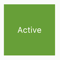
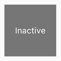
by creating three simple examples: TapboxA, TapboxB,
and TapboxC. The examples all work similarly—each
creates a container that, when tapped, toggles between a
green or grey box. The `_active` boolean determines the
color: green for active or grey for inactive.
我们将通过创建三个简单示例来举例说明管理状态的不同方式:
TapboxA、TapboxB 和 TapboxC。
这些例子功能是相似的——
每创建一个容器,当点击时,在绿色或灰色框之间切换。
`_active` 确定颜色:绿色为 true,灰色为 false。
These examples use [`GestureDetector`][] to capture activity
on the `Container`.
这些示例使用 [`GestureDetector`][] 捕获 `Container` 上的用户动作。
### The widget manages its own state
### widget 管理自己的状态
Sometimes it makes the most sense for the widget
to manage its state internally. For example,
[`ListView`][] automatically scrolls when its
content exceeds the render box. Most developers
using `ListView` don't want to manage `ListView`'s
scrolling behavior, so `ListView` itself manages its scroll offset.
有时,widget 在内部管理其状态是最好的。
例如,当 [`ListView`][] 的内容超过渲染框时,
ListView 自动滚动。大多数使用 `ListView`
的开发人员不想管理 `ListView` 的滚动行为,
因此 `ListView` 本身管理其滚动偏移量。
The `_TapboxAState` class:
`_TapboxAState` 类:
* Manages state for `TapboxA`.
管理 `TapboxA` 的状态。
* Defines the `_active` boolean which determines the
box's current color.
定义布尔值 `_active` 确定盒子的当前颜色。
* Defines the `_handleTap()` function, which updates
`_active` when the box is tapped and calls the
`setState()` function to update the UI.
定义 `_handleTap()` 函数,该函数在点击该盒子时更新
`_active`,并调用 `setState()` 更新 UI。
* Implements all interactive behavior for the widget.
实现 widget 的所有交互式行为。
```dart
import 'package:flutter/material.dart';
// TapboxA manages its own state.
//------------------------- TapboxA ----------------------------------
class TapboxA extends StatefulWidget {
const TapboxA({super.key});
@override
State createState() => _TapboxAState();
}
class _TapboxAState extends State {
bool _active = false;
void _handleTap() {
setState(() {
_active = !_active;
});
}
@override
Widget build(BuildContext context) {
return GestureDetector(
onTap: _handleTap,
child: Container(
width: 200,
height: 200,
decoration: BoxDecoration(
color: _active ? Colors.lightGreen[700] : Colors.grey[600],
),
child: Center(
child: Text(
_active ? 'Active' : 'Inactive',
style: const TextStyle(fontSize: 32, color: Colors.white),
),
),
),
);
}
}
//------------------------- MyApp ----------------------------------
class MyApp extends StatelessWidget {
const MyApp({super.key});
@override
Widget build(BuildContext context) {
return MaterialApp(
title: 'Flutter Demo',
home: Scaffold(
appBar: AppBar(title: const Text('Flutter Demo')),
body: const Center(child: TapboxA()),
),
);
}
}
```
### The parent widget manages the widget's state
### 父 widget 管理 widget 的 state
Often it makes the most sense for the parent widget
to manage the state and tell its child widget when to update.
For example, [`IconButton`][] allows you to treat
an icon as a tappable button. `IconButton` is a
stateless widget because we decided that the parent
widget needs to know whether the button has been tapped,
so it can take appropriate action.
一般来说父 widget 管理状态并告诉其子 widget 何时更新通常是最合适的。
例如,[`IconButton`][] 让你将图标视为可点按的按钮。
`IconButton` 是一个无状态 widget,
因为我们认为父 widget 需要知道该按钮是否被点击来采取相应的处理。
In the following example, TapboxB exports its state
to its parent through a callback. Because TapboxB
doesn't manage any state, it subclasses StatelessWidget.
在以下示例中,TapboxB 通过回调将其状态到其父类。
由于 TapboxB 不管理任何状态,因此它继承自 StatelessWidget。
The ParentWidgetState class:
ParentWidgetState 类:
* Manages the `_active` state for TapboxB.
为 TapboxB 管理 `_active` 状态;
* Implements `_handleTapboxChanged()`,
the method called when the box is tapped.
实现 `_handleTapboxChanged()`,当盒子被点击时调用的方法;
* When the state changes, calls `setState()`
to update the UI.
当状态改变时,调用 `setState()` 更新 UI。
The TapboxB class:
TapboxB 类:
* Extends StatelessWidget because all state is handled by its parent.
继承 StatelessWidget 类,因为所有状态都由其父 widget 处理;
* When a tap is detected, it notifies the parent.
当检测到点击时,它会通知父 widget。
```dart
import 'package:flutter/material.dart';
// ParentWidget manages the state for TapboxB.
//------------------------ ParentWidget --------------------------------
class ParentWidget extends StatefulWidget {
const ParentWidget({super.key});
@override
State createState() => _ParentWidgetState();
}
class _ParentWidgetState extends State {
bool _active = false;
void _handleTapboxChanged(bool newValue) {
setState(() {
_active = newValue;
});
}
@override
Widget build(BuildContext context) {
return SizedBox(
child: TapboxB(active: _active, onChanged: _handleTapboxChanged),
);
}
}
//------------------------- TapboxB ----------------------------------
class TapboxB extends StatelessWidget {
const TapboxB({super.key, this.active = false, required this.onChanged});
final bool active;
final ValueChanged onChanged;
void _handleTap() {
onChanged(!active);
}
@override
Widget build(BuildContext context) {
return GestureDetector(
onTap: _handleTap,
child: Container(
width: 200,
height: 200,
decoration: BoxDecoration(
color: active ? Colors.lightGreen[700] : Colors.grey[600],
),
child: Center(
child: Text(
active ? 'Active' : 'Inactive',
style: const TextStyle(fontSize: 32, color: Colors.white),
),
),
),
);
}
}
```
### A mix-and-match approach
### 混搭管理
For some widgets, a mix-and-match approach makes
the most sense. In this scenario, the stateful widget
manages some of the state, and the parent widget
manages other aspects of the state.
对于一些 widget 来说,混搭管理的方法最合适的。
在这种情况下,有状态的 widget 自己管理一些状态,
同时父 widget 管理其他方面的状态。
In the `TapboxC` example, on tap down,
a dark green border appears around the box. On tap up,
the border disappears and the box's color changes. `TapboxC`
exports its `_active` state to its parent but manages its
`_highlight` state internally. This example has two `State`
objects, `_ParentWidgetState` and `_TapboxCState`.
在 `TapboxC` 示例中,点击时,
盒子的周围会出现一个深绿色的边框。
点击时,边框消失,盒子的颜色改变。
`TapboxC` 将其 `_active` 状态导出到其父 widget 中,
但在内部管理其 `_highlight` 状态。
这个例子有两个状态对象 `_ParentWidgetState` 和 `_TapboxCState`。
The `_ParentWidgetState` object:
`_ParentWidgetState` 对象:
* Manages the `_active` state.
管理`_active` 状态。
* Implements `_handleTapboxChanged()`,
the method called when the box is tapped.
实现 `_handleTapboxChanged()`,此方法在盒子被点击时调用。
* Calls `setState()` to update the UI when a tap
occurs and the `_active` state changes.
当点击盒子并且 `_active` 状态改变时调用 `setState()` 来更新 UI。
The `_TapboxCState` object:
`_TapboxCState` 对象:
* Manages the `_highlight` state.
管理 `_highlight` state。
* The `GestureDetector` listens to all tap events.
As the user taps down, it adds the highlight
(implemented as a dark green border). As the user releases the
tap, it removes the highlight.
`GestureDetector` 监听所有 tap 事件。
当用户点下时,它添加高亮(深绿色边框);
当用户释放时,会移除高亮。
* Calls `setState()` to update the UI on tap down,
tap up, or tap cancel, and the `_highlight` state changes.
当按下、抬起、或者取消点击时更新 `_highlight` 状态,
调用 `setState()` 更新UI。
* On a tap event, passes that state change to the parent widget to take
appropriate action using the [`widget`][] property.
当点击时,[`widget`][] 属性将状态的改变传递给父 widget 并进行合适的操作。
```dart
import 'package:flutter/material.dart';
//---------------------------- ParentWidget ----------------------------
class ParentWidget extends StatefulWidget {
const ParentWidget({super.key});
@override
State createState() => _ParentWidgetState();
}
class _ParentWidgetState extends State {
bool _active = false;
void _handleTapboxChanged(bool newValue) {
setState(() {
_active = newValue;
});
}
@override
Widget build(BuildContext context) {
return SizedBox(
child: TapboxC(active: _active, onChanged: _handleTapboxChanged),
);
}
}
//----------------------------- TapboxC ------------------------------
class TapboxC extends StatefulWidget {
const TapboxC({super.key, this.active = false, required this.onChanged});
final bool active;
final ValueChanged onChanged;
@override
State createState() => _TapboxCState();
}
class _TapboxCState extends State {
bool _highlight = false;
void _handleTapDown(TapDownDetails details) {
setState(() {
_highlight = true;
});
}
void _handleTapUp(TapUpDetails details) {
setState(() {
_highlight = false;
});
}
void _handleTapCancel() {
setState(() {
_highlight = false;
});
}
void _handleTap() {
widget.onChanged(!widget.active);
}
@override
Widget build(BuildContext context) {
// This example adds a green border on tap down.
// On tap up, the square changes to the opposite state.
return GestureDetector(
onTapDown: _handleTapDown, // Handle the tap events in the order that
onTapUp: _handleTapUp, // they occur: down, up, tap, cancel
onTap: _handleTap,
onTapCancel: _handleTapCancel,
child: Container(
width: 200,
height: 200,
decoration: BoxDecoration(
color: widget.active ? Colors.lightGreen[700] : Colors.grey[600],
border: _highlight
? Border.all(color: Colors.teal[700]!, width: 10)
: null,
),
child: Center(
child: Text(
widget.active ? 'Active' : 'Inactive',
style: const TextStyle(fontSize: 32, color: Colors.white),
),
),
),
);
}
}
```
An alternate implementation might have exported the highlight
state to the parent while keeping the active state internal,
but if you asked someone to use that tap box,
they'd probably complain that it doesn't make much sense.
The developer cares whether the box is active.
The developer probably doesn't care how the highlighting
is managed, and prefers that the tap box handles those
details.
另一种实现可能会将高亮状态导出到父 widget,
同时保持 active 状态为内部,
但如果你要求某人使用该 TapBox,他们可能会抱怨说没有多大意义。
开发人员只会关心该框是否处于活动状态。
开发人员可能不在乎高亮显示是如何管理的,
并且倾向于让 TapBox 处理这些细节。
## Other interactive widgets
## 其他交互式 widgets
Flutter offers a variety of buttons and similar interactive widgets.
Most of these widgets implement the [Material Design guidelines][],
which define a set of components with an opinionated UI.
Flutter 提供各种按钮和类似的交互式 widget。
这些 widget 中的大多数都实现了 [Material Design guidelines][],
它们定义了一组具有质感的 UI 组件。
If you prefer, you can use [`GestureDetector`][] to build
interactivity into any custom widget.
You can find examples of `GestureDetector` in
[Managing state][]. Learn more about the `GestureDetector`
in [Handle taps][], a recipe in the Flutter cookbook.
如果你愿意,你可以使用 [`GestureDetector`][]
来给任何自定义 widget 添加交互性。
你可以在 [管理状态][Managing state] 中找到 `GestureDetector` 的示例。
同时你也可以在 Flutter 实用教程的 [处理点击][Handle taps]
中学习更多关于 `GestureDetector` 的内容。
:::tip
Flutter also provides a set of iOS-style widgets called
[`Cupertino`][].
Flutter 还提供了一组名为 [`Cupertino`][] 的 iOS 风格的 widget。
:::
When you need interactivity, it's easiest to use one of
the prefabricated widgets. Here's a partial list:
当你需要交互性时,最容易的是使用预制的 widget。
这是预置 widget 部分列表:
### Standard widgets
### 标准 widgets
* [`Form`][]
* [`FormField`][]
### Material Components
### Material 组件
* [`Checkbox`][]
* [`DropdownButton`][]
* [`TextButton`][]
* [`FloatingActionButton`][]
* [`IconButton`][]
* [`Radio`][]
* [`ElevatedButton`][]
* [`Slider`][]
* [`Switch`][]
* [`TextField`][]
## Resources
## 资源
The following resources might help when adding interactivity
to your app.
以下资源可能会在给你的应用添加交互的时候有所帮助。
[Gestures][], a section in the Flutter cookbook.
[手势][Gestures],Flutter 实用教程里的一个小节。
[Handling gestures][]
How to create a button and make it respond to input.
[处理手势][Handling gestures]
如何创建一个按钮并使其响应用户动作。
[Gestures in Flutter][]
A description of Flutter's gesture mechanism.
[点击、拖动和其他手势][Gestures in Flutter]
Flutter 手势机制的描述。
[Flutter API documentation][]
Reference documentation for all of the Flutter libraries.
[Flutter API 文档][Flutter API documentation]
所有 Flutter API 的参考文档。
Wonderous app [running app][wonderous-app], [repo][wonderous-repo]
Flutter showcase app with a custom design and engaging interactions.
[Wonderous app][wonderous-app] 应用,[代码仓库][wonderous-repo]
Flutter 展示应用,采用独特的设计和引人入胜的交互方式。
[Flutter's Layered Design][] (video)
This video includes information about state and
stateless widgets. Presented by Google engineer, Ian Hickson.
[Flutter 的分层设计][Flutter's Layered Design CN] (视频)
此视频包含有关有状态和无状态 widget 的信息。
由 Google 工程师 Ian Hickson 讲解。
[Android emulator]: /platform-integration/android/setup#set-up-devices
[`Checkbox`]: https://api.flutter-io.cn/flutter/material/Checkbox-class.html
[`Cupertino`]: https://api.flutter-io.cn/flutter/cupertino/cupertino-library.html
[Dart language documentation]: https://dart.cn/language
[Debugging Flutter apps]: /testing/debugging
[`DropdownButton`]: https://api.flutter-io.cn/flutter/material/DropdownButton-class.html
[`TextButton`]: https://api.flutter-io.cn/flutter/material/TextButton-class.html
[`FloatingActionButton`]: https://api.flutter-io.cn/flutter/material/FloatingActionButton-class.html
[Flutter API documentation]: https://api.flutter-io.cn
[Flutter's Layered Design CN]: https://www.bilibili.com/video/BV1b441157vV
[Flutter's Layered Design]: https://www.youtube.com/watch?v=dkyY9WCGMi0
[`FormField`]: https://api.flutter-io.cn/flutter/widgets/FormField-class.html
[`Form`]: https://api.flutter-io.cn/flutter/widgets/Form-class.html
[`GestureDetector`]: https://api.flutter-io.cn/flutter/widgets/GestureDetector-class.html
[Gestures]: /cookbook/gestures
[Gestures in Flutter]: /ui/interactivity/gestures
[Handling gestures]: /ui#handling-gestures
[new-flutter-app]: /reference/create-new-app
[`IconButton`]: https://api.flutter-io.cn/flutter/material/IconButton-class.html
[`Icon`]: https://api.flutter-io.cn/flutter/widgets/Icon-class.html
[`InkWell`]: https://api.flutter-io.cn/flutter/material/InkWell-class.html
[iOS simulator]: /platform-integration/ios/setup#set-up-devices
[building layouts tutorial]: /ui/layout/tutorial
[community]: https://flutter.cn/community
[Handle taps]: /cookbook/gestures/handling-taps
[`lake.jpg`]: https://github.com/cfug/flutter.cn/blob/main/examples/layout/lakes/step6/images/lake.jpg
[Libraries and imports]: https://dart.cn/language/libraries
[`ListView`]: https://api.flutter-io.cn/flutter/widgets/ListView-class.html
[`main.dart`]: https://github.com/cfug/flutter.cn/blob/main/examples/layout/lakes/step6/lib/main.dart
[Managing state]: #managing-state
[Material Design guidelines]: https://m3.material.io/styles
[`pubspec.yaml`]: https://github.com/cfug/flutter.cn/blob/main/examples/layout/lakes/step6/pubspec.yaml
[`Radio`]: https://api.flutter-io.cn/flutter/material/Radio-class.html
[`ElevatedButton`]: https://api.flutter-io.cn/flutter/material/ElevatedButton-class.html
[wonderous-app]: https://wonderous.app//web
[wonderous-repo]: https://github.com/gskinnerTeam/flutter-wonderous-app
[set up]: /install
[`SizedBox`]: https://api.flutter-io.cn/flutter/widgets/SizedBox-class.html
[`Slider`]: https://api.flutter-io.cn/flutter/material/Slider-class.html
[`State`]: https://api.flutter-io.cn/flutter/widgets/State-class.html
[`StatefulWidget`]: https://api.flutter-io.cn/flutter/widgets/StatefulWidget-class.html
[`StatelessWidget`]: https://api.flutter-io.cn/flutter/widgets/StatelessWidget-class.html
[`Switch`]: https://api.flutter-io.cn/flutter/material/Switch-class.html
[`TextField`]: https://api.flutter-io.cn/flutter/material/TextField-class.html
[`Text`]: https://api.flutter-io.cn/flutter/widgets/Text-class.html
[`widget`]: https://api.flutter-io.cn/flutter/widgets/State/widget.html